Friday 25 October 2013

Cropping exercises.


We had the chance to go off to Witley Court and take many photographs that we could then develop by using various cropping and editing exercises. I have chose this one in particular because i saw a few changes i could make to this to develop it into being more better.

By doing this exercise it has enabled me to get used to cropping and editing pictures in different ways, especially with this particular photo i have also realised that there is a lot of things you can take away from the photo to make it even more better and make the audience to focus on a specific object in the picture. In this case the fountain is the main focus and in the second picture the fountain is definitely looking far more effective than the first one. The amount of grass in the original first photo was not needed therefore i chose to crop it out to see it it changed what the audience's eyes would focus on first. After cropping the picture to me is a lot more successful.

Tuesday 22 October 2013

My Preliminary Task


I have create a magazine which only had to include the front cover and a contents page which was a preliminary task.

On my front cover i have used a medium close up of Fran. The reason why i chose this picture in particular is because i feel that it really links in with the fact that Fran is a winner therefore the happiness and smiles straight away shows that she will be the main topic of this magazine. Fran is looking straight into the camera and this shows direct address which is effective because it shows that it could appeal to you personally.

When doing this task i was able to refer back to the codes and conventions task which i did a while back and see what looked effective and appealing to the school. In this case i chose to keep the front cover of the magazine very simple and easy to read because over crowded isn't any help to the readers as there is just too much information. I think everything is very clear and visible. The reason why i have also used the colours red and black is because that.s the conventional colours of the school. I think everything on the front cover works really well together.

I have also considered to include the left third which will help the readers see what magazine it is as the first thing they will notice is the 'TO' and the school badge inside the 'O'. This is something i have also gathered from the codes and conventions task as well as other research about magazines. A left third is very important.

Looking back on the font which i have used, i think it works well because it'd very bold and very easy to read. The typography is very important because it's something that could possibly affect the whole magazine. Therefore i personally think that the font and colours i have used work very well and appeals to any target audience.

For the contents page, i decided to make it a little bit more busier than the front cover because i do feel that sometimes the contents page is what gets looked at making the reader more interested in any specific topics which are included. i have decided to include some pictures on the contents page just to give an idea to the readers about all the other pictures that could be in the magazine. The contents page is an extra thing to my magazine making it even more interesting.

The Benefits of me  trying out this task is to develop and improve my knowledge on the different codes and conventions of a magazine. It will also be something i would like to look back on to make any improvements and use this as a piece of guidance when making my actual final magazine.

Friday 18 October 2013

Self-Assessment Criteria.

The 5 tasks that i have previously done were all magazine covers. I have realized however when looking back that there are a couple of improvements i could have made for each of them. My favourite one, and the one i think looks the most realistic is probably the 'M' drake magazine.The reason for this is because i think the use of The drake CD as something to be able to win is very relateable to the actual magazine as the main star is Drake.

I have justified each magazine to why i used the certain fonts and some of the main cover line picture i have used. I have gave reasons however after looking back after i have came to the conclusion that it could have looked better and i could improve them next time if i had the chance to.There are many ways i could Enhance teach of my magazines:


'M' Magazine with Drake, i think this was my most successful one because it could be something that could be used in real life. The reasons for this is because i feel that its not to over crowded giving specific information and then linking a R&B/ Rap star story as a main cover line.


'M' Magazine with spicy something was something i found a little bit tricky because i'm not particularly into Jazz music so therefore i wasn't too sure what to write or include. I think this magazine could be improved a lot with the font and colours. I used green because i thought it looked good with the rest of the band and represented harmony however i'm not really sure if this is something successful.


'Music_X' Magazine:I think this was another magazine which i particularly liked the font and colour i used because it really fit in well with the edited part of the main Image. This magazine is also one which isn't too over crowded, its clear and everything looks like its in the right place.
'Pitch music for the masses' magazine: this magazine in particular was something i struggled with because i'm not really into the Rock genre therefore in terms of picking any pictures for the main cover lines i didn't have a clue what artist to include until i researched into it. I used a scary image because i thought the theme of the magazine came across as something quite extraordinary and quite scary. Therefore i thought to add another weird picture with the cover star Marilyn Manson. I really liked the font i used because its one which is think really fits in well with the whole them of the magazine. i wouldn't find this as a real magazine.

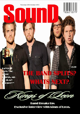
SounD Magazine: I really think there is a lot i could enhance with this magazine particularly because i think this is probably something you wouldn't find as a real magazine. The use of Hayley as one of the cover lines is not what i am supposed to do, because its not really in the music genre. The font could have been better also, even though is did think it fit in well.


In the future i think i could look at a few of these to help me improve, as well as having the Drake magazine. I like how its quite spread out and clear to read but has that effect of looking like a real magazine.

5th typography task.

For this SounD magazine with Kings Of Leon, i decided to use the colours white and red because they fit in well as the masthead is red.The typography matches the cover stars and the font colour is used to stand out again the black colours. The cover lines are to the left of the page as it makes them the main subject doesnt take attention away from them.There are two main cover lines, which are repeated about the band breaking up.

Friday 11 October 2013

4th TYPOGRAPHY TASK.


As soon as i saw the main image i was sure that the font i would use is 'Matisse ITC' because it looks like it would be used in a horror film indicating danger. it almost looks scary to read. The main image  is strong and hes making eye contact which means hes directly appealing to the reader. I also chose to use a second image  as a cover line of him because i want the reader to know that he is the main topic. The other cover line i chose was a band called 'The Monsters' which i made up, the picture looks scary and these cover lines make the whole magazine look like its a dangerous one to read.


3rd TYPOGRAPHY HOMEWORK TASK


When picking what font i thought would be the best for this magazine i considered 'BROADWAY' because i thought that the font emphasizes the picture being classical and the colour looks well with the colours on the picture looking almost 3D. i chose these cover lines in particular because i know that this particular star 'Hayley Williams' is someone who does different types of music genres as well as this artist Bjork

2nd magazine from TYPOGRAPHY TASK.


This is the second magazine which i have added onto. The reason why i used this fancy font is because the name is 'Spicy Something' so i decided to use a bit of a decorative font. I think this font fits in well because the main cover picture isn't serious so it would look well with any bold or strong font. Its quite funky and i think they look like they have a funky and bubbly personality. The reason why i chose the color green is because i think it really stood out and green indicates harmony and its very commonly associated with money. i think it looked very good along with the red masthead.

Thursday 10 October 2013

Typography Homework Responses:


My task was to make this magazine appeal to a mass target audience and focus on mainly the R&B music industry. The reason why i have chose to use the font 'Rockwell extra bold' is because i wanted the font to look very big and bold. i think this font fits in well because its nothing too fancy or chic its quite bold and fits the whole main image. it shouts at the reader because its so big and bold. i have also chose to include the story lines on the side using a drake album which you can win and a story about a R&B rapper.

Annotated Magazine.


I have decided to choose this magazine and annotate all the different codes and conventions included in this magazine. I have used the Billboard magazine with Miley on the front because i felt like she had a very strong image and in particular had all the different reasons for this magazine to be successful. 


Wednesday 9 October 2013

TYPOGRAPHY.


During today's task, we had to choose which font suited the main image in these 'Vibes' magazine templates.
I decided to chose the top 3 which i think suit the image Christina Aguilera is trying to create. This is called typography.

 Personally i think that the font in picture E is the one which suits the main image the best. The font in E has a very urban and chic effect to it which makes it retain an element of elegance and chicness. The boldness of the font really matches the theme of the title of the magazine.This is the one that i would personally choose to be on the front cover of this magazine. The word 'Machine Mutha' looks a little bit like a machine font, so it really appeals well with the whole Main cover photo.

The second best one, which i thought was also effective and suited the magazine is B. I do like the effect of each start of the word the letter being bold because it almost shows two sides of the font as well as two sides of Christina. Even though the font is very bold and stand out a lot, which is obviously a very strong and important thing, but i just don't think it works as well as E does.

The third one i have chosen that could possibly work well with the whole image is probably A.