Friday 13 December 2013

Page Plus practice.


Today's lesson was about getting used to a new software called page plus. In order to help us try out this software we had to create a magazine front cover, contents page and a double page spread. in today's lesson I have created a front cover and a contents page sticking to my target audience and focusing on the pop music genre I have chosen.


The star i have used on my front cover is Selena Gomez because i know that she is a huge star in the music industry and a lot of young girls look up to her and see her as an inspiration. Choosing the right picture/person for the front cover image is vital because it is what the customers see first and therefore it must make a good impression and grab the attention in order for someone to buy it. In this particular magazine i have decided to stick with the colour pink, because it's a very girly colour and it could mean more girls would probably be more attracted to. i have kept it pretty simple but it still looks busy. Normally pop magazine are very crowded giving as much information as possible and this is a way to show how much of the money the magazine is worth. In this case i have made the front cover busy but sticking to small amount of information, probably the man topics inside the magazine.

With the contents page i have decided to include the same font as the Masthead, and kept everything simple and plain.I feel that the contents page has to be easy to read because that is something which navigates you through the magazine. I have only included a few of the page numbers but making it simpler will be better because i do expect young girls buying this music magazine.

Friday 6 December 2013

Questionnaire.


I have decided to make a questionnaire which will provide feedback for me to influence me what they would like to see inside the magazine. I will print off around 20 copies and give them out. From this feedback i will be able to take any results and  put them into a pie chart or a graph to see which are the most popular answers. This will only really help me in terms of knowing what is the favorable genre of music.And i will also know what they like reading inside the magazines therefore it will give me an idea of what to do for a double page spread.

Thursday 5 December 2013

Planning

 Recently I have began to start planning out what king of character I would like on the front cover of my magazine. To show an example of what my idea is, I have researched 3 pictures of random girls of the internet which I personally think would really suit the POP music genre and therefore look perfect on a pop music magazine. Then reason why I have chose to use picture which are from the internet is because a lot of people stereotype the appearance of girls and I have also done the same with these three pictures in particular.

The three pictures which I have chosen are ones which I personally feel stereotypically would be used on the front cover of a pop genre music magazine. Each of these girls have a beautiful smile which draws a lot of attention to their faces. A smile is very important because it makes the face. Their skin is also perfect with beautiful long thick hair. The make up on each of these girls does look quite natural which is also important. All these features are always something which younger girls who read these magazine look up to and wish they had some of these features. Even though the camera angle on these pictures isn't aren't the perfect, as there isn't eye contact in the first one and the third one isn't a mid-shot, it still gives an idea of some of the features the readers look at from a girls magazine.

A front cover is the first thing which the reader/customer sees therefore it has to attract girls attentions. A pretty, perfect looking girl would definitely grab attention because girls straight away begin to admire her looks as well as then reading what this magazine is about.

This is only an example to create an imagination/idea of what I would like the photography and model for my front cover look. I would like to use this as a guide to any make up styles or how my chosen star of my magazine should look like. I would also like to take some sample photographs of any of my friend after making this post to be able to see how different style of make up work, as well as positions of the camera. I hopefully will be able to get feedback from other people on their first impressions when they see the photographs I have taken.


Friday 22 November 2013

Planning - Evaluation of Double Page Spread.

As well as looking at the front covers of magazine like To pf the Pops and We love POP, i have also looked at a few of the double page spreads inside the magazine. A double page spread if definitely something that has to be eye catching because it takes up 2 of the pages.


I've decided to pick out a double page spread out of a Top of the Pops magazine and annotate it with the different conventions that make is successful. I think its important to make a double page spread very bold and i find that this one is definitely bright and bold. As soon as you turn the page you can already tell that this is Little Mix.This is important because using someone which is popular in the music industry will certainly attract attention especially at the target audience, which is young teenage girls. I have mainly looked at the information and layout of this page. The layout is very simple yet strong because the audience are able to clearly see what and who this is about. Overall the colours used are pretty simple, having some of the words in yellow indicating they are important. Then advertisement is very useful because its an extra credit to attract young girls. The prize is linked with Little Mix as they have chose to use a signed make up bag. This is a brilliant way to persuade the fans of little mix to own a make up bag signed by this girl band. Therefore that's another thing which is used as a way to attract the readers.


Thursday 21 November 2013

Research into similar products: my own We Love Pop Magazine


As I mentioned in the previous post I really wanted to have a go at making something very similar to the 'We love POP' magazine because I felt it differed from the 'Top of the Pop's slightly. I noticed that this magazine always included a fashion advertisement on the front cover, where as Top of the Pops haven't. therefore i included a small fashion section in the corner. I have also included the masthead which was always slightly slanted on each magazine. The masthead is covering my original photography slightly however it's very bold and clear which is important because therefore it stands out much more. The main colour focus was purple because of the masthead i have picked. When everything is matching it all looks very neat. I have also decided to make some of the coverlines, including the date and price in yellow. This is because the dress which i have picked stood out from the rest and i felt that making some other coverlines the same colour as the dress would make it much more interesting. I also got rid of the background because all of the magazines i have looked at, had a plain background. The white background works really well with any dark colour therefore everything looks good together. the original photography which i have used maybe could have been better as the flash covers the features of Fran's face however i thought it was pretty because it really outlined her eyes. Fran is looking straight at the camera therefore it's direct address to the audience making it appeal to them in particular. By using a teenage girl could indicate to readers that is mainly targeted at teenage females. Fran is smiling which makes the audience feel welcomed into the magazine. i have decided to use very popular artists on the front of my magazine because that always grabs attention. Especially using Justin Bieber on the front because he is a teenage pop sensation.

Tuesday 12 November 2013

More music magazine Analysis.


Recently I have only really been focusing on the 'Top of the Pops' music magazine for young teens. However I have also came across the 'We love Pop' magazine which is very similar. I have done my research and have focused on what appears to be on this magazine repeatedly. This magazine does differ from the 'Top of the Pops' magazine because this magazine looks a lot more busier and always has a fashion topic on the front cover of the magazine.
I have also realised that the colour pink is used an awful lot on teenage magazines and that's to appeal to the female gender which is very important. Particularly the 'We love Pop' magazine, uses a lot of pink colours on nearly every magazine I have came across.

I have decided to try and produce my own version of this 'We Love Pop' magazine to get as close as possible to achieving the same appearance and the impression that the magazine creates when a reader first looks at it. Before creating my magazine I have looked at these 2 in particular because I like the effect they give to the readers.

I think both of these two magazines have a very similar layout but still look very different. Therefore I have decided to try and make a third magazine which looks a little bit like these 2.


Tuesday 5 November 2013

Drafting: Remake - Remodel Task


For this task i had to choose an existing magazine and create the front cover which would match the style of the genre and audience that the original magazine was aimed at. Because i have recently been focusing on the pop music genre i decided to go with 'Top of the pops' which is a magazine loved by teenagers and includes the whole pop music package. I added my own original photography along with the cover lines, pugs, colours, fonts and the little bits and pieces like barcodes, datelines and the price to make this magazine successful. I have only annotated the codes and conventions of this magazine. Underneath will be the Photography mise-en-scene which i have also written about.

Photography Mise-en-scene:
Setting and Location: Originally the photo would be taken in a studio where there is a lot of space so that the subjects and any props can be managed effectively.

Costume, Hair and Make-up: The original Photography which i have taken is very natural and clear. Its not anything busy or over the top, Shannon looks very delicate and pure. I think the whole picture is natural because her hair is naturally down as well as her make up which is also delicate and natural looking. The knitted jumper she is wearing is the colour baby pink. This also gives this delicate effect to it. By having all these delicate colour involved its very easy to make the font and information to stand out on the magazine, in this case i think the colours work very well together.

Facial Expressions: Shannon's facial expressions are very warm and welcoming. The way she is smiling indicates to the reader that its inviting him into the magazine. She is using direct address with the reader meaning shes helping to stimulate interaction.

Lighting: The lighting in this particular photography i think is very warm and gentle. The whole edit of the photo works really well with the Masthead and the colours used for the font. Lighting is very important because it could show the mood or the feelings of someone. In this case the whole image looks very warm and happy.

Layout: The layout of this magazine is quite busy. After doing my research on the previous post taking a look at some of the 'top of the pops' magazines i have spotted that the magazine are all very full and packed with information. They try and include a lot of the information because the magazine does have a lot to offer. In my magazine i have tried to make it look busy but still make it clear, including some of the things a real 'top of the pops' magazine would include, for example the Pugs, every top of the pops magazine includes at least 2 pugs.

Ethos/Philosophy: I personally think that my magazine would defiantly match what an original 'top of the pops' magazine would look like. After doing my research and looking back i have included everything that a teenage magazine has to offer. My original photography was a friendly welcoming picture of a teenage girl also which helps invite the young readers in. The main colours on this front cover were pink which shows that i have aimed it at young females in particular as this was my target audience. The celebrities i have included were linked into the pop music genre. Using pop sensations Justin Bieber and famous pop female artist like Jessie J and Selena Gomez shows that i have chosen artist which will be easily recognised by the young girls. Especially using Justin Bieber as a way to attract the young female fans in particular.Teenage pop magazines also offer gifts with the magazine, in this case i have also included gifts like poster and a lip gloss to show the extra attraction towards my magazine. Including a chance to win any prizes also shows there is a lot more to the magazine inside. For all these reasons i do fell that i have successfully met the Ethos and Philosophy of the magazine of my choice.

Monday 4 November 2013

''Top of the Pops'' Magazines.

There is most likely a medium close up of the famous artist on every magazine front cover. Looking at this example in particular Justin Bieber has full eye contact with the reader. This is direct address making this magazine appeal to you. The reason why they have used a male as the front cover is because the images of males is what attracts the females in particular. Any Justin Bieber fans who find this artist inspirational, especially females,will look at this magazine because it creates an attachment between the readers and the artist. This could reinforce the fact that the pop genre has diversity. The artist which is on the front cover is always quite current in the music aspect, which once again creates an interest base for the readers.

The image is most likely also placed against a plain background, this is in order for the dominant picture to stand out.
The Coverlines are scattered all around the magazine to emphasise all the information gathered in this article. The way they're placed all around the magazine is also to show the image in a rule of thirds layout this is what reflects that the magazine is clear and well organised even though it may look quite busy.
Direct address is used also to appeal to the reader in particular. The males picture around this magazine shows that t

All three of these magazines have an imagine of the artist which shows direct address to the reader. The direct eye contacts helps the reader feel invited. The fact that the artists are smiling creates a comfortable atmosphere for the audience. The imagery and connotations from the main image is bubbly, exciting and friendly.


Research into the 'pop' Music Genre.

RESEARCH INTO POP GENRE:

  • From about 1967 the term of ‘pop’ was increasingly used in opposition to the term rock music, a division that gave generic significance to both terms. Throughout its development, pop music has absorbed influences from most other genres of popular music.
  • Pop music as a genre is usually seen as existing and developing separately. Pop music may be used to describe a distinct genre, aimed at a youth market, often characterized as a softer alternative to rock and roll.
So i have also decided to do some research into the pop genre because i feel that the pop genre in this century is very popular especially with the teenage years.
I have particularly researched into the characteristics of the typical pop music genre and therefore gathered some vital information about this music genre in particular.

Characteristics of the typical pop music genre:
- An aim of appealing to a general audience rather than to a particular sub-culture of ideology.
-A tendency to reflect existing trends rather than progressive developments.
- Much pop music is intended to encourage dancing, or it uses dance-oriented beats and rhythms.


FAMOUS POP ARTISTS:
  • Best know previously for co-writing the massive Miley Cyrus hit 'Party in the USA' and also Jessie J has a tremendous Buzz following her in the music industry.
  • Another example of a artist which exploded into the public is Bruno Mars. It was said that ''Bruno Mars' voice is one of the key sounds of pop music in 2010''
  • And obviously not forgetting Justin Bieber who is a Canadian pop musician and a singer-songwriter. Justin Bieber was discovered in 2008 by American talent manager Scooter Braun. A huge success was brought by this boy in the pop genre and the whole music industry.

EXAMPLES OF SOME POP MAGAZINES:


  • The masthead on all of these is very BOLD and OUTLINED.
  • Very BRIGHT and BOLD colours used like pink and yellow to attract the attention of the audience. This helps and ensures that the reader notices the magazine from far away.
  • Main Coverline is BOLD and is also larger than the other Coverlines around on the font cover. This main Coverline is also in BOLD colours because its more important than the rest, its eye-catching.
  • The Main image is always a famous artist. The artist always uses direct-address which means it has eye contact with the reader producing this connection with the audience. The expressions on the artist face makes the reader feel invited.
  • Looking at these 4 examples a lot of the pop music magazine use the colour pink on the front cover which connotes that the magazine is aimed at the female audience in particular.
  • Most pop magazines Coverlines are subjected on boys, fashion beauty and poop artists. These themes in particular attract the female gender. Pop magazine also include things like posters of famous boy bands, female/male artists.

Friday 25 October 2013

Cropping exercises.


We had the chance to go off to Witley Court and take many photographs that we could then develop by using various cropping and editing exercises. I have chose this one in particular because i saw a few changes i could make to this to develop it into being more better.

By doing this exercise it has enabled me to get used to cropping and editing pictures in different ways, especially with this particular photo i have also realised that there is a lot of things you can take away from the photo to make it even more better and make the audience to focus on a specific object in the picture. In this case the fountain is the main focus and in the second picture the fountain is definitely looking far more effective than the first one. The amount of grass in the original first photo was not needed therefore i chose to crop it out to see it it changed what the audience's eyes would focus on first. After cropping the picture to me is a lot more successful.

Tuesday 22 October 2013

My Preliminary Task


I have create a magazine which only had to include the front cover and a contents page which was a preliminary task.

On my front cover i have used a medium close up of Fran. The reason why i chose this picture in particular is because i feel that it really links in with the fact that Fran is a winner therefore the happiness and smiles straight away shows that she will be the main topic of this magazine. Fran is looking straight into the camera and this shows direct address which is effective because it shows that it could appeal to you personally.

When doing this task i was able to refer back to the codes and conventions task which i did a while back and see what looked effective and appealing to the school. In this case i chose to keep the front cover of the magazine very simple and easy to read because over crowded isn't any help to the readers as there is just too much information. I think everything is very clear and visible. The reason why i have also used the colours red and black is because that.s the conventional colours of the school. I think everything on the front cover works really well together.

I have also considered to include the left third which will help the readers see what magazine it is as the first thing they will notice is the 'TO' and the school badge inside the 'O'. This is something i have also gathered from the codes and conventions task as well as other research about magazines. A left third is very important.

Looking back on the font which i have used, i think it works well because it'd very bold and very easy to read. The typography is very important because it's something that could possibly affect the whole magazine. Therefore i personally think that the font and colours i have used work very well and appeals to any target audience.

For the contents page, i decided to make it a little bit more busier than the front cover because i do feel that sometimes the contents page is what gets looked at making the reader more interested in any specific topics which are included. i have decided to include some pictures on the contents page just to give an idea to the readers about all the other pictures that could be in the magazine. The contents page is an extra thing to my magazine making it even more interesting.

The Benefits of me  trying out this task is to develop and improve my knowledge on the different codes and conventions of a magazine. It will also be something i would like to look back on to make any improvements and use this as a piece of guidance when making my actual final magazine.

Friday 18 October 2013

Self-Assessment Criteria.

The 5 tasks that i have previously done were all magazine covers. I have realized however when looking back that there are a couple of improvements i could have made for each of them. My favourite one, and the one i think looks the most realistic is probably the 'M' drake magazine.The reason for this is because i think the use of The drake CD as something to be able to win is very relateable to the actual magazine as the main star is Drake.

I have justified each magazine to why i used the certain fonts and some of the main cover line picture i have used. I have gave reasons however after looking back after i have came to the conclusion that it could have looked better and i could improve them next time if i had the chance to.There are many ways i could Enhance teach of my magazines:


'M' Magazine with Drake, i think this was my most successful one because it could be something that could be used in real life. The reasons for this is because i feel that its not to over crowded giving specific information and then linking a R&B/ Rap star story as a main cover line.


'M' Magazine with spicy something was something i found a little bit tricky because i'm not particularly into Jazz music so therefore i wasn't too sure what to write or include. I think this magazine could be improved a lot with the font and colours. I used green because i thought it looked good with the rest of the band and represented harmony however i'm not really sure if this is something successful.


'Music_X' Magazine:I think this was another magazine which i particularly liked the font and colour i used because it really fit in well with the edited part of the main Image. This magazine is also one which isn't too over crowded, its clear and everything looks like its in the right place.
'Pitch music for the masses' magazine: this magazine in particular was something i struggled with because i'm not really into the Rock genre therefore in terms of picking any pictures for the main cover lines i didn't have a clue what artist to include until i researched into it. I used a scary image because i thought the theme of the magazine came across as something quite extraordinary and quite scary. Therefore i thought to add another weird picture with the cover star Marilyn Manson. I really liked the font i used because its one which is think really fits in well with the whole them of the magazine. i wouldn't find this as a real magazine.

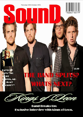
SounD Magazine: I really think there is a lot i could enhance with this magazine particularly because i think this is probably something you wouldn't find as a real magazine. The use of Hayley as one of the cover lines is not what i am supposed to do, because its not really in the music genre. The font could have been better also, even though is did think it fit in well.


In the future i think i could look at a few of these to help me improve, as well as having the Drake magazine. I like how its quite spread out and clear to read but has that effect of looking like a real magazine.

5th typography task.

For this SounD magazine with Kings Of Leon, i decided to use the colours white and red because they fit in well as the masthead is red.The typography matches the cover stars and the font colour is used to stand out again the black colours. The cover lines are to the left of the page as it makes them the main subject doesnt take attention away from them.There are two main cover lines, which are repeated about the band breaking up.

Friday 11 October 2013

4th TYPOGRAPHY TASK.


As soon as i saw the main image i was sure that the font i would use is 'Matisse ITC' because it looks like it would be used in a horror film indicating danger. it almost looks scary to read. The main image  is strong and hes making eye contact which means hes directly appealing to the reader. I also chose to use a second image  as a cover line of him because i want the reader to know that he is the main topic. The other cover line i chose was a band called 'The Monsters' which i made up, the picture looks scary and these cover lines make the whole magazine look like its a dangerous one to read.


3rd TYPOGRAPHY HOMEWORK TASK


When picking what font i thought would be the best for this magazine i considered 'BROADWAY' because i thought that the font emphasizes the picture being classical and the colour looks well with the colours on the picture looking almost 3D. i chose these cover lines in particular because i know that this particular star 'Hayley Williams' is someone who does different types of music genres as well as this artist Bjork

2nd magazine from TYPOGRAPHY TASK.


This is the second magazine which i have added onto. The reason why i used this fancy font is because the name is 'Spicy Something' so i decided to use a bit of a decorative font. I think this font fits in well because the main cover picture isn't serious so it would look well with any bold or strong font. Its quite funky and i think they look like they have a funky and bubbly personality. The reason why i chose the color green is because i think it really stood out and green indicates harmony and its very commonly associated with money. i think it looked very good along with the red masthead.

Thursday 10 October 2013

Typography Homework Responses:


My task was to make this magazine appeal to a mass target audience and focus on mainly the R&B music industry. The reason why i have chose to use the font 'Rockwell extra bold' is because i wanted the font to look very big and bold. i think this font fits in well because its nothing too fancy or chic its quite bold and fits the whole main image. it shouts at the reader because its so big and bold. i have also chose to include the story lines on the side using a drake album which you can win and a story about a R&B rapper.

Annotated Magazine.


I have decided to choose this magazine and annotate all the different codes and conventions included in this magazine. I have used the Billboard magazine with Miley on the front because i felt like she had a very strong image and in particular had all the different reasons for this magazine to be successful. 


Wednesday 9 October 2013

TYPOGRAPHY.


During today's task, we had to choose which font suited the main image in these 'Vibes' magazine templates.
I decided to chose the top 3 which i think suit the image Christina Aguilera is trying to create. This is called typography.

 Personally i think that the font in picture E is the one which suits the main image the best. The font in E has a very urban and chic effect to it which makes it retain an element of elegance and chicness. The boldness of the font really matches the theme of the title of the magazine.This is the one that i would personally choose to be on the front cover of this magazine. The word 'Machine Mutha' looks a little bit like a machine font, so it really appeals well with the whole Main cover photo.

The second best one, which i thought was also effective and suited the magazine is B. I do like the effect of each start of the word the letter being bold because it almost shows two sides of the font as well as two sides of Christina. Even though the font is very bold and stand out a lot, which is obviously a very strong and important thing, but i just don't think it works as well as E does.

The third one i have chosen that could possibly work well with the whole image is probably A.

Monday 23 September 2013

Magazine Template...


After taking various photographs of Fran, and choosing this one in particular,I have created my own template of a school magazine. I have decided to link the picture in with the main topic. Fran is looking straight at the camera and this shows direct address towards the reader which is effective because it appeals to you personally. This is only a template which i will use to help me when making my music magazine because of the different types of features I've used.

Thursday 19 September 2013

an idea for my student magazine...


So this time for my student magazine, i decided to take a photo of one of my friends. I have chosen this photo in particular as the front cover because i feel that its very eye catching the way its edited. i think this will look particularly well as its the perfect size and looks quite professional. On the front cover of the magazine i will have sneak peak information about school activities like sports/clubs/events. i would like to have a big title, and the main topic would be an interview with Fran, as she has achieved something in the school. The contents page would include the most important things like events, and information for parents and students. it will all be layered out clearly to understand. i would like this magazine to look very real because i really feel like the picture is a very good example of what a front cover could look like. I would like to really think about positioning the information onto this photo accurately so that it doesn't ruin the effect this picture has, but make it look even more professional. i personally think that because this picture includes quite a lot of dark colors, the font color i particularly wanted to use is bring bold colors like yellow or red.

Friday 13 September 2013

Music Magazines


Billboard Magazine Covers 2012
I decided to pick out this music magazine in particular as an example of what i'd like to achieve in the end.I think the first thing that grab's my attention is the huge picture of Justin Bieber as i'm a fan and it would be something i'd be very interested to read. The way he is standing with a small shadow dropping slightly onto the text at the bottom looks very effective because it almost gives the 3D effect which makes him look like the most important in the magazine, 'the main topic'. The way he is holding his chain and bottom of his trousers shows a bit of cheekiness and direct address because he is looking particularly at you.The background color is quite delicate which then makes the yellow text look vibrant. Even though his name(Justin Bieber) is in white, i think it still has the effect as its the same color as the masthead, underlined and a short quote from him.Justin Bieber and Usher Billboard Magazine - May 2012 002 via justinbieberzone.com

Yes i have chose another one with Justin Bieber, because i think it's another good example of  what someones body language can mean. As you can see the first thing draws your attention would be the two artists. The way Usher is standing shows a sense of happiness. The way Justin is standing shows a sense of cheekiness again, achievement, and confidence. I love the fact that their names are in a very tiny print.This shows that by looking at the magazine you will know who they are because they're so well known. 'TOP OF THEIR GAME' shows they work together.


my favorite song.

http://www.youtube.com/watch?v=R4em3LKQCAQ

Personally for me i really like using YouTube, i find it easy navigating around YouTube and it also shows you all the new songs from the particular artist as well as suggesting other you may like to listen to.
The positive feature would be that its all for free and very easy to use

Friday 6 September 2013

media photo

In today's media lesson i have took this picture and have uploaded it when completing a cropping exercise, i have also added the 'STACS' at the top just like the magazine article. I have used this photo as an example of my ICT skills hope this would help me later on when making my official music magazine.

First Post

First post! welcome to my blog, in this project i will be creating my own music magazine. this blog will be used as a diary from my media AS project.